A note about e caudata
In the Junicode documentation I state, "Because Junicode has been designed for medievalists, some of the default letter-shapes are wrong for modern languages: for example, eogonek (ę) is correctly shaped for medieval Latin but looks poor in Polish." But in a feature request left on the Junicode Project Page, Adam Twardoch says, "The best references one can find, such as Claude Garamond's original matrices that are stored at the Plantin Moretus museum in Antwerp, include the "e caudata" glyph intended for medievalist use (Garamond cast his typefaces well before ę was used in Polish), and that design shows the glyph exactly at it should be shaped." The photos showing Garamond's matrices are here and here, and they do show precisely what Adam says they show. (The second of these also shows a c with cedilla placed far to the right of where we find it in most modern typefaces.)
Before I capitulate and alter the design of eogonek (e caudata) in Junicode, I should explain more fully why it looks the way it does.
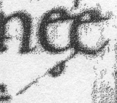
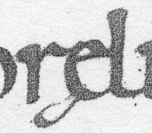
In the medieval manuscripts I am most familiar with (English ones of the ninth to twelfth centuries), e caudata clearly shows its affinity with the ligature æ. In the work of the eleventh-century Canterbury scribe Eadui Basan, for example, it generally takes one of these forms:
|
|
That is, the cauda generally attaches to the e somewhere in the southwest quadrant. In some manuscripts it attaches at the bottom of the e, as in London, British Library, Harley 3707, a late 12th-century French manuscript of Baudri de Bourgueil's Historia Hierosolymitana:

|
However, I have never seen the cauda attach to the "end of the 'e' stroke," as Adam says, in a manuscript. I should like to see evidence that a "right-aligned" ogonek is, as Adam claims, "standard medieval practice."
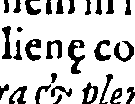
In printed Latin texts, e caudata is fairly elusive, since many editors (or printers) transcribe it as æ, ae or simply e. I have not found it, for example, in the book whose roman face Junicode is based on, George Hickes, Linguarum Vett. Septentrionalium Thesaurus (Oxford, 1703-05). Here is one example from another English book, Franciscus Junius, Sacrorum parallelorum libri tres, 2nd ed. (London, 1588), p. 182:
|
Certainly the cauda seems to have trended rightward here, though not as far right as in Garamond's matrices.
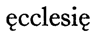
In modern editions of Latin and early English texts, the cauda is often omitted, or e caudata is transcribed as ae. In editions I have seen that retain the cauda, it generally attaches to the bottom of the e, as in these examples:
| Bernhard Fehr, ed., Die hirtenbriefe Ælfrics in altenglischer und lateinischer fassung (Hamburg: Grand, 1914), p. 64 |

|
| E.V.K. Dobbie, ed., Beowulf and Judith (New York: Columbia UP, 1953), p. 66 |

|
| A. Campbell, ed., Charters of Rochester (London: Oxford UP, 1973), p. 22 |
|
| And finally an italic example: Celia Sisam and Kenneth Sisam, ed., The Salisbury Psalter (London: Oxford UP, 1959), p. 256 |
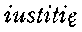
|
I do not take Garamond's example lightly; but though he is a giant in the history of type design, he is, finally, one practitioner of the art. Adam cites no others. For my part, I have been reading medieval manuscripts and modern editions of medieval texts for many years, and I can plausibly claim to know something about what medievalists are used to seeing and what they expect in a typeface. Perhaps my experience is too narrow, and the books I know are all badly done. But I have at least demonstrated that it is far from a "myth" that in editions of medieval Latin texts the cauda is commonly attached to the bottom of the e.
Perhaps it is time to admit that the Latinate cauda and the ogonek used by Polish and other languages are different beasts. I accept that the ogonek should be aligned right; clearly the cauda can be aligned right as well. But if the ogonek must be aligned right while the cauda is free to wander around the bottom of the base character, then perhaps the cauda should have its own code point. Anyone care to join a proposal to the Unicode Consortium?